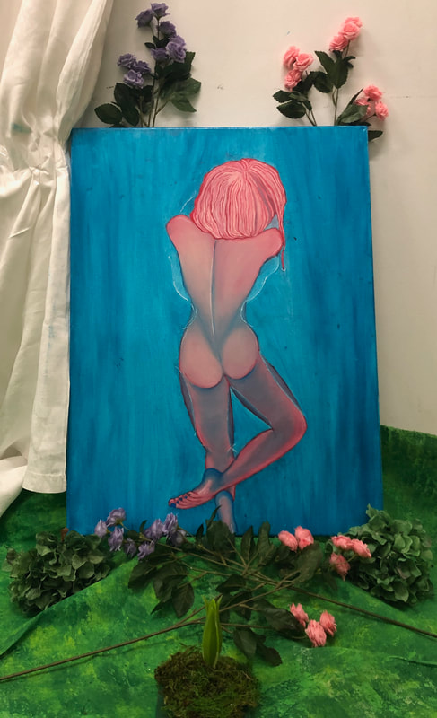
Project 9
"Happy Painting", 2019


1. Define which techniques you tried and mastered? Struggled?
2. How did you draw inspiration from other artists techniques or aesthetics in your work? In what ways did you derive meaning or gain historical perspectives from their work? Why these artists?
3. Describe the evolution of your piece. Decisions made. Compositional elements.
4. If you could consider doing something over, explain why you would do this and what you would do next time?
5. Elaborate on how this piece links with your other pieces? What is the common thread?
Techniques I mastered for this project was being able to create value color transitions and color contrasts. This painting is a painting of a realistic human anatomy with abstract colors. In order to make an anatomically realistic body the abstract color needed to be painted as if they are normal. In order to normalize pink and blue skin tones on the structure of a human body I needed to master value. Value was the most crucial aspect to accomplish this painting. By mastering value I was also able to make transitions between pinks and blues and purples while also sustaining contrast between the colors. Having contrast between the colors allowed for there to be highlights and shadows. There being a contrast in colors illustrated where parts of the body were closer in view and closer in foreground than other parts of the body which were further away and in between the background and middle ground.
The original inspiration to this painting was a digital painting that I came across on Pinterest. The image was a repost and therefore I do not have an artist's name to this digital painting. Original picture I gained inspiration from:

If I could do something over for this project, I would have researched more into linseed slow drying oil. This became a very useful tool to creating this painting however, not only did I never work with oil paint before but I had never worked with linseed oil before. This types of oil used with oil painting is the type that makes oil paint dry even slower than its approximate 24 hour drying time. The blue water surrounding the body was a mixture of blue and green oil paint I created and then mixed together with linseed oil. I placed this first layer of oil paint and linseed oil on and the day after I placed a layer of linseed oil on top of this. This became a problem when it is the night before my art show and the oil paint and linseed oil mixture on the canvas is not drying. This is when I do my research into linseed oil and slow drying oil. After two hours and more of blow drying my painting the night before the art show and letting it sit all night long, it was still a big problem at the art show the next day at 5:00 pm when the paint isn't drying and the corners of the canvas are smearing on the white cloths behind it. I also would have glued on fake flowers in similar placement as in the original picture if the paint would have dried already. Nonetheless, I am thankful for not glueing these flowers on in fear of making all my work in light and dark color contrast to make it appear 3D would result in making it look 2D.
This piece connect to my other pieces with the theme of nature and using nature to symbolize women. However, this time was different because there was a real women subject present in this piece. There was no symbolism. In my mind, which I tried to display with the use of fake flowers surrounding it and the fake sprouting in front of it, the woman subject herself is a fantastical nature goddess. The majority of all my other pieces from this years art show and last years art show were all very dark and saddening art pieces but this year I wanted to capture growth and evolution of individuals after facing physical and emotional abuse. Happy Painting was the speak to the individuals in the audience who have had, or someone close to them has, experience with the social injustices like domestic abuse, rape, sexual assault, sex trafficking, and so on... I wished to reach out to them with the use of this painting and express to them that there is a future for them to have all their power, strength, and happiness in this world.
I also placed the sprouting in front of this powerful, nature goddess because I wanted to create a story line. All these pieces of nature wilting and dying and having the life sucked out of them can still turn into this spouting and that sprouting will grow into a powerful, happy, successful women.
Project 8
"The Foot Print You Leave", 2019

1. Define which techniques you tried and mastered? Struggled?
2. How did you draw inspiration from other artists techniques or aesthetics in your work? In what ways did you derive meaning or gain historical perspectives from their work? Why these artists?
3. Describe the evolution of your piece. Decisions made. Compositional elements.
4. If you could consider doing something over, explain why you would do this and what you would do next time?
5. Elaborate on how this piece links with your other pieces? What is the common thread?
The techniques I mastered was using a sponge to create texture and value between color with many groups of dots and still keeping a color contrast between the yellows, light greens, and dark greens.
I didn't gain an inspiration for any other artists or anything from social medias. My Project 5, Imprint, did provide inspiration for me for this project however on a larger scale and with less detail.
There was no evolution to this piece. It is almost the exact same as the original sketch. In the original sketch I had multiple pathways of foot prints to multiple art pieces however in the final piece, there was only one pathway of foot prints to the large body sculpture. As well, in the art show the tarp was folded to be made way smaller than it's actual size. The actual size of the tarp was approximentaly 7 ft x 12 ft.
If I could redo this project, I would have added glossier acrylic paints to it because the entire tarp ended up being matte colors. I believe that including some reflective areas like the foot prints would make the piece more vibrant. I also wish that I found a better way to paint the foot prints. I painted them red for fire and lava but I think the audience did not realize this and felt that the foot prints were blood instead. The foot prints are not blood at all. They are more like fire and deforestation marks left of the Earth where you may see its trail of damage.
This piece is similar to the rest of my piece because of the nature theme. The nature theme is to symbolize women in this art show.
Project 7
"What Would've Been" , 2019


Disclaimer: the tree stumps and grass were not real.
1. Define which techniques you tried and mastered? Struggled?
2. How did you draw inspiration from other artists techniques or aesthetics in your work? In what ways did you derive meaning or gain historical perspectives from their work? Why these artists?
3. Describe the evolution of your piece. Decisions made. Compositional elements.
4. If you could consider doing something over, explain why you would do this and what you would do next time?
5. Elaborate on how this piece links with your other pieces? What is the common thread?
Some techniques I mastered for this project was compositional elements. This project required a lot of compositional placement in order to achieve the most atheistically pleasing look. I tested many placements from where the tree barks should be to the fake grass and dirt. Other techniques I felt that I mastered was creating a balance between value transitions between the colors while keeping a light and dark color contrast when painting the wooden base of the sculpture. It took many layers of paint but I was able to create the right value transitions between yellow, light green and dark green. This allowed me to have color contrast. I struggled with nailing the barks of wood into the wooden base I also struggled with glueing down all the fake grass and dirt so it wouldn't slide off the base when transporting it.
I found inspiration for this piece by browsing deforestation artwork on social medias like Instagram and Pinterest. There were no particular other artists that provided inspiration. The images that I did find that provided ideas for me did not mention any artists names because they were reposts.
There was not a large evolution to this piece. One big difference between my original sketch and the final creation was in the final piece there were three tree stumps whereas in the original sketch it was one large stump alone. Another difference between my original sketches and the final piece is that in the final piece the grass base was very green and lively and in the original sketches the base was filled more with dead grass and not lively flora.
If I could do something over, I would have painted the base to have more browns in it. As well, I would've made the white threads coming from the tree stumps be taller and closer to the ceiling.
This art piece links to the rest of my pieces from the obvious nature theme, connecting back to the overall theme of using nature to symbolize women.
Project 6
"Wilting" , 2019


Beginning with the first picture, there is a colorful, lively flower that has been uprooted and placed somewhere not suitable for life. The flower has begun to wilt and has already lost some petals. It can be assumed that this flower will someday look like the other flowers who have lost almost all of their petals with only 2 or 3 left. All the flowers are suspended in mid-air, far away from the green grass below where most of nature grows. The flowers are stuck alone in a place that doesn't sustain life with a barcode stuck on the side.
This piece was very symbolic. The common theme I used in this art show was the use of nature as the symbolic objects to represent women. My intention for this piece was to address human trafficking or more specifically, human sex trafficking. Using the flowers for symbolism, these girls were taken far away from where they were found and placed in an unsuitable to live and all separated from one another. They are also on display for so many to see and a barcode to use for purchasing if someone becomes interested.
1. Define which techniques you tried and mastered? Struggled?
2. How did you draw inspiration from other artists techniques or aesthetics in your work? In what ways did you derive meaning or gain historical perspectives from their work? Why these artists?
3. Describe the evolution of your piece. Decisions made. Compositional elements.
4. If you could consider doing something over, explain why you would do this and what you would do next time?
5. Elaborate on how this piece links with your other pieces? What is the common thread?
After making about 11 of these flowers, I feel that I have mastered skills for composition elements. I had a lot of practice with using composition to place the dry grass and flower petals in the most aesthetically pleasing potions. I aimed to have an equal amount of balance and contrast while maintaining a focal point. I intended to have the flower as the main focal point in every piece. I feel that I I successfully did so and was able to master this. I also wanted enough contrast between a colorful or lively flower and lifeless, dry, brown grass. I feel that I also succeeded in doing so. There is an obvious contrast between a flower growing in a place that is place that is seemingly dead or inhabitable. I also wanted to keep that contrast while also placing beautiful flower petals on dead, dry grass. I believe that I was able to keep the dead, dry grass noticeable while having the flower petals on the grass and around it. I feel that I mastered keeping that balance between flower petals and the dry grass while also establishing an obvious contract between the color of the flowers vs. the dry grass and the idea of a flower being place in an unsuitable, poor living condition.
For this piece, I did not gain any inspiration for artists but for the symbolic meaning of this piece, I gained inspiration from real life events. I gained a lot of inspiration from the R. Kelly law suits and accusations. Although sex trafficking was never something R. Kelly was accused of or charged with, after watching the documentary series Surviving R. Kelly, the testimonies so many girls shares really rattled me. The nature of their interactions and relationships with R. Kelly along with how they were forced to live within R. Kelly's house provided a lot of things I would've never considered. This provided me inspiration for this art piece.
There was really not an extensive evolution to this art piece. In my original sketch, I had always planned for the flowers to be placed in the center of a piece of wood obviously unsuitable for the flower to be in with a barcode on it hanging from the ceiling. Some thing that did change from the original sketch however was the base of the wood. I knew that I wanted the base to be wood but the wood ended up being very thin, light balsa wood instead of a very thick, heavy square. This was very lucky considering it was to be hanging from the ceiling. The color of the base also changed from a dark red and black like cooled lava changed to tan, brownish, dry grass. Another aspect of my original sketch that ended up not being includes was to make a plaster wrap hand plucking the petals off of a flower.
If I could do something over, I would have pre-cut the fishing wire to hang the flowers up with before the art show because that unexpectedly took up a lot of my art show set up time. If I had done so all 11 of these flowers that I made would've been hanging and I wouldn't of run out of time to set them up.
The common thread of these piece is the use of nature to symbolize women. Another common thread was to create awareness about sex trafficking which would tie back to the overarching meaning of the show, women, and people, are more than a resource. That women should not be treated and used as a resource.
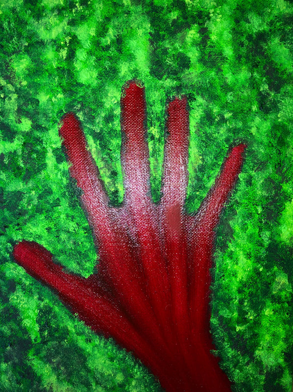
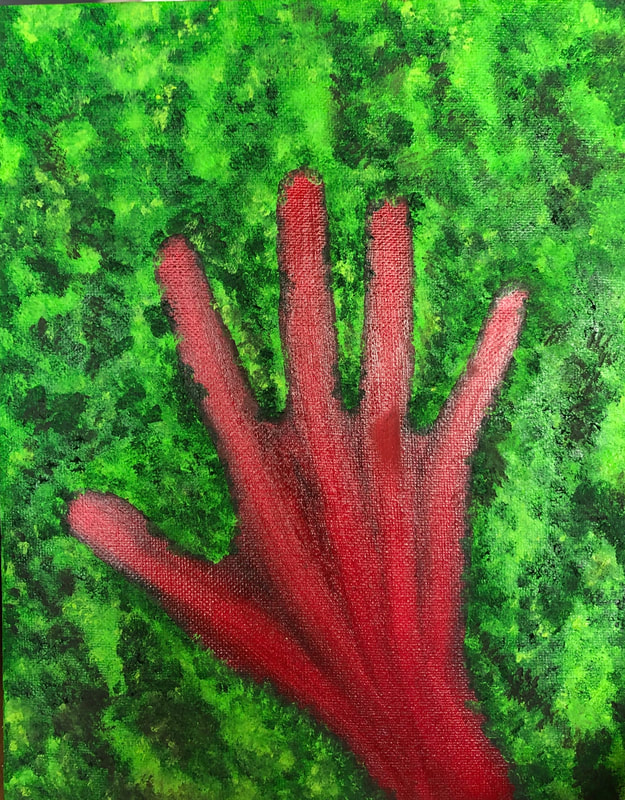
Project 5
"Imprint", 2019
1. Define which techniques you tried and mastered? Struggled?
2. How did you draw inspiration from other artists techniques or aesthetics in your work? In what ways did you derive meaning or gain historical perspectives from their work? Why these artists?
3. Describe the evolution of your piece. Decisions made. Compositional elements.
4. If you could consider doing something over, explain why you would do this and what you would do next time?
5. Elaborate on how this piece links with your other pieces? What is the common thread?
This was my first try with mixable water oil paints. It was a very new medium for me however, there were some techniques that I was able to master. I believe that I was able to master techniques of layering the paint which created a lot of texture. I wished to create a lot of 3D texture of the plants and I felt that I was able to accomplish this. I figured out how to begin with the first layer of the canvas; beginning with a lighter green and then layering more and more as the paint dried. I was able to leave more 3D layers of paint without the colors blending too much or the paint becoming flat. I also believe that a technique that I mastered was blending of color and creating value. These techniques apply more to the red handprint than the plant area. I was able to create a lot of shadow in the hand through use of value. There are harsher and softer transitions of lighter and darker colors throughout the hand. These shadows and highlights always for there to be more dimension to the hand even if the hand is not intended to be realistic. Something that I did struggled with though was lines. I painted the plants and the hand to have very harsh outlines and it impacted the painting as a whole a lot. It caused there to be no relationship between the hand and the plants. They appeared like two pieces, a random combination, painted onto the same canvas. My art teacher Mrs. O'Ryan helped a lot with is and provided very helpful strategies. She helped to explain that if I were to press my hand into grass, the blades of grass would pour over onto my hand. There would not be any harsh lines barricading the grass from touching my hand. She suggested that I paint how the grass would overlap onto my hand. This helped me to be able to tie the two things together. Something else she suggested was to mix the dark green paint with the dark red paint and add in that color here and there to the plants. Doing this created a not obvious tie-together of the two pieces.
There were not any particular artists or art pieces that I gained inspiration from for this painting.
There was not a lot of evolution to this art piece. The general look of the painting was the same as my original sketch. What changed was the overlapping of the grass onto the hand and the medium. Before I knew about mixable water oil paint, my original sketch and idea was to paint the base green and cover it with fake grass. My other original idea was to paint the base black with a little bit of red but them cover it with hot glue to give it a rocky, very 3D texture as if it was cooled lava. The general theme has remained the same and changing to using mixable water oil pants was the favorable choice and I am very happy with it.
If I could redo this piece, I would add in more yellow, raised dots a little like pointillism to add in more highlights but keeping the 3D structure.
This piece links to my other pieces in an obvious way. I have a common reoccurrence from last year of painting or sculpting hands. This piece also links to the pieces that will be in my art show though a common creation of nature.
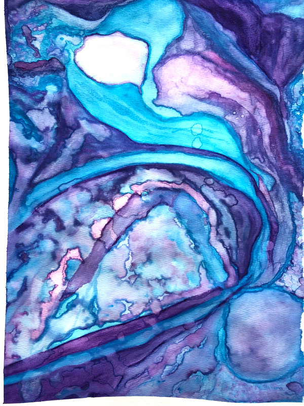
Project 4
Watercolor, 2018

1. Define which techniques you tried and mastered? Struggled?
2. How did you draw inspiration from other artists techniques or aesthetics in your work? In what ways did you derive meaning or gain historical perspectives from their work? Why these artists?
3. Describe the evolution of your piece. Decisions made. Compositional elements.
4. If you could consider doing something over, explain why you would do this and what you would do next time?
5. Elaborate on how this piece links with your other pieces? What is the common thread?
For this watercolor piece, I tried many little techniques such as:
The evolution of my art piece began with wanting to create something similar to the Pinterest post and completely changed unintentionally into a very abstract art piece with only a similarity in color placement. The change of my piece wasn’t intended I began with the watercolor and simply went with it and was pleasantly surprised by the outcome. From there I didn’t fight it.
If I could do this over, I would have used a larger paper, stuck with darker colors in simple design in the bigger areas of the paper and the corners for more detailed watercolors. On top of the darker, simpler areas, there would be spray paint for stars and I wouldn’t drawn lines and curves like longitude and latitude across the larger paper. I would have also created a focal point and not something so abstract.
The color thread with the piece is the use of water colors and the colors purple and blue. The larger common thread is the goal of creating astronomical art pieces.
2. How did you draw inspiration from other artists techniques or aesthetics in your work? In what ways did you derive meaning or gain historical perspectives from their work? Why these artists?
3. Describe the evolution of your piece. Decisions made. Compositional elements.
4. If you could consider doing something over, explain why you would do this and what you would do next time?
5. Elaborate on how this piece links with your other pieces? What is the common thread?
For this watercolor piece, I tried many little techniques such as:
- Place droplets of water onto the paper and with the brush add in the colors to the water and either let them dry there or mix them around for a certain color.
- To create certain colors I also tried the same time off to the side of my watercolor palette where I mixed together different shades of blue and purple. This however, was not very successful the colors were not very distinct from the rest.
- My biggest technique with watercolors that I feel I have mastered was creating value with watercolors. I feel that I did a very good job at a darker shades blended into lighters shades and when intended, having really soft transitions of shades of one color or one color into another color. I also enjoying creating that contrast of color right next to each other as much as I loved the values.
- What I really struggled with was composition. Working in corners of the painting can naturally for me choosing the composition and what I wanted. As I moved towards the center there was way more blank space and larger areas to fill in. I felt that I really lacks a focal point in the end but not adding in a different medium or even a different style of paint.
The evolution of my art piece began with wanting to create something similar to the Pinterest post and completely changed unintentionally into a very abstract art piece with only a similarity in color placement. The change of my piece wasn’t intended I began with the watercolor and simply went with it and was pleasantly surprised by the outcome. From there I didn’t fight it.
If I could do this over, I would have used a larger paper, stuck with darker colors in simple design in the bigger areas of the paper and the corners for more detailed watercolors. On top of the darker, simpler areas, there would be spray paint for stars and I wouldn’t drawn lines and curves like longitude and latitude across the larger paper. I would have also created a focal point and not something so abstract.
The color thread with the piece is the use of water colors and the colors purple and blue. The larger common thread is the goal of creating astronomical art pieces.
Project 3
Portrait Sketching, 2018


1. Define which techniques you tried and mastered? Struggled?
2. How did you draw inspiration from other artists techniques or aesthetics in your work? In what ways did you derive meaning or gain historical perspectives from their work? Why these artists?
3. Describe the evolution of your piece. Decisions made. Compositional elements.
4. If you could consider doing something over, explain why you would do this and what you would do next time?
5. Elaborate on how this piece links with your other pieces? What is the common thread?
From this art project, I feel that what I accomplished was mastering contrast between light and dark. What I feel that I struggled with this piece was depth, creating the illusion that the face was 3D, and how to draw the hair.
I draw a lot of inspiration from other artist. I have seen so many pencil sketches of portraits on Instagram and Pinterest that I really want to be able to create that myself. Instagram artists, @art.istratova, @maloart, and @art_overnight. The sketches from Pinterest are difficult to find the artists names when the artworks were re-posted by other accounts. I admired what they could create and wanted to give it a try.
What I mentally envisioned from the beginning of the mouth, nose, and eyebrows, all came out as I hoped for. When I struggled giving 3D, roundness for the head, I change from wavy, down hair style to an up do in attempt to give more shape. I followed with what I saw on most social media pencil drawings, plain background. Throughout this process I tried to use what skilled I had learned from my charcoal self portrait to create this portrait. When working with different mediums this became difficult to do as well when I am not using a realistic photo of myself to go off of.
If I could redo this project, I would have liked to learn how to use watercolor paints for realistic skin tones, eye colors, and hair colors. I think that would have created more lively-ness to the piece. I would like to learn how to create values with paint, more than just with pencil or charcoal. I would also consider trying to create this piece with pens and using lines instead of value shading. It is also a style that I have seen before on social media.
This piece connects to my other pieces because that is a dark, light contrast within this piece as there is within my other pieces. It is also a black and white portrait only with different mediums and different color paper used.
Project 2
No Experience Needed, 2018
1. Define which techniques you tried and mastered? Struggled?
2. How did you draw inspiration from other artists techniques or aesthetics in your work? In what ways did you derive meaning or gain historical perspectives from their work? Why these artists?
3. Describe the evolution of your piece. Decisions made. Compositional elements.
4. If you could consider doing something over, explain why you would do this and what you would do next time?
5. Elaborate on how this piece links with your other pieces? What is the common thread?
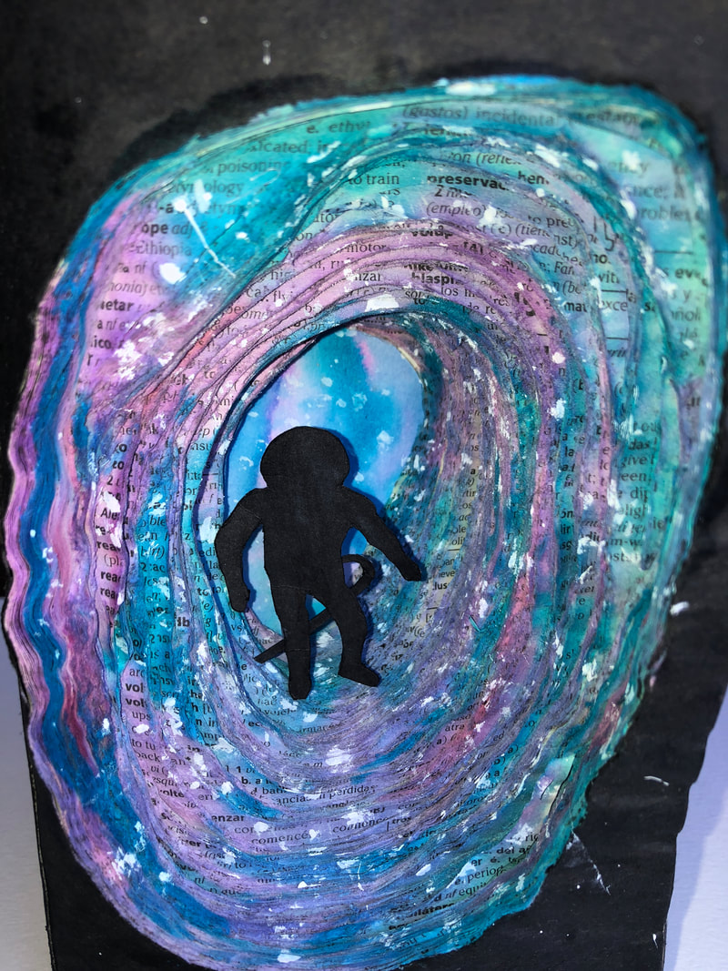
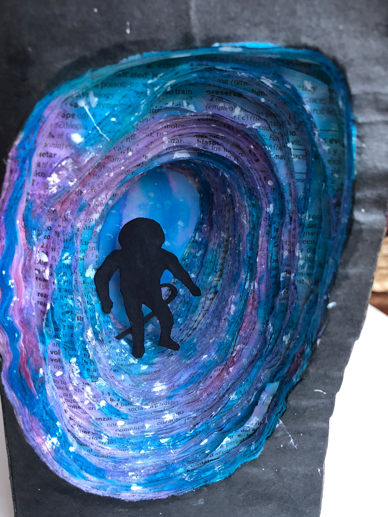
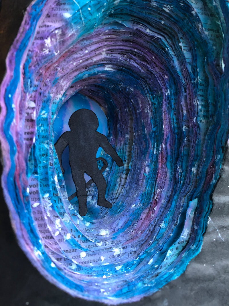
This was my first try at carving a book into a sculpture. I looked through Pinterest to I look for carvings done before by other artists. Most of them seemed very intricate. So I looked for different videos of book carvings done before but I couldn't find any that were for an art project but just for hallowing a book out as a box. One of the videos did show gluing down some of the pages before carving. This was a technique that I tried with the first layer or two. Once the glued dried it created a lot of spacing between the pages. I didn't like the look of it and this created some inconsistency with the rest of the book. This was a new technique that was experimental that proved to be a struggle however, in the end it all worked out. I technique I believe I mastered was creating many different dimensions in the art piece. There were various layers with different foregrounds and backgrounds. However, carving the paper so that it was clean, accurate, and not ripped was a difficult thing to do.
When looking for inspiration for a project to do, there were many examples on Pinterest. However, the one image that I found to be inspiring, there was no artist name to go along with the image or instructions how to do carve the sculpture. The image was of different layers that spiral throughout the book into smaller cut outs with a 3D boat in it. I didn't derive any historical meaning from only an image of this art piece especially when I do not know what the specific book was or who the artist was. The boat appeared to be an older sail. The meaning that I could interpret to this art piece was the journey of becoming lost in a book because there is an anchor on the first page of the book before entering the spirals.
The beginning of this piece was just trying something new and committing to making a book into a sculpture. I originally had the mental image of making a cave like structure that lead to a galaxy and stars at the end of the cave and glueing the first couple of sections of pages together. Shortly after I didn't add any more glue and into a few of the layersI realized I would be difficult to shape the pages into rocks and could take some more powerful tools than sandpaper. So, the plan for this project changed to keeping the many layers only sanded down somewhat. I also changed my original idea to having a galaxy background at the end of the book to an attempted watercolor galaxy at the end of the book and the entire book. I then added in the stars with white paint later on. What I felt was needed for my focal point was an astronaut floating in this galaxy.
If I could redo this project, I would have sectioned off the pages and have either card stock or cardboard between the sections so there is no accidental carving into the next section. I believe this would have made a clearer cut pages. I would also not included any glue. Th glue gave a very wrinkled, open gaps between the pages.
The common thread of this piece to other from last year has been the blue and purple colors and from this year so far, is the black and white contrast however I used a different medium for this project than those.
2. How did you draw inspiration from other artists techniques or aesthetics in your work? In what ways did you derive meaning or gain historical perspectives from their work? Why these artists?
3. Describe the evolution of your piece. Decisions made. Compositional elements.
4. If you could consider doing something over, explain why you would do this and what you would do next time?
5. Elaborate on how this piece links with your other pieces? What is the common thread?
This was my first try at carving a book into a sculpture. I looked through Pinterest to I look for carvings done before by other artists. Most of them seemed very intricate. So I looked for different videos of book carvings done before but I couldn't find any that were for an art project but just for hallowing a book out as a box. One of the videos did show gluing down some of the pages before carving. This was a technique that I tried with the first layer or two. Once the glued dried it created a lot of spacing between the pages. I didn't like the look of it and this created some inconsistency with the rest of the book. This was a new technique that was experimental that proved to be a struggle however, in the end it all worked out. I technique I believe I mastered was creating many different dimensions in the art piece. There were various layers with different foregrounds and backgrounds. However, carving the paper so that it was clean, accurate, and not ripped was a difficult thing to do.
When looking for inspiration for a project to do, there were many examples on Pinterest. However, the one image that I found to be inspiring, there was no artist name to go along with the image or instructions how to do carve the sculpture. The image was of different layers that spiral throughout the book into smaller cut outs with a 3D boat in it. I didn't derive any historical meaning from only an image of this art piece especially when I do not know what the specific book was or who the artist was. The boat appeared to be an older sail. The meaning that I could interpret to this art piece was the journey of becoming lost in a book because there is an anchor on the first page of the book before entering the spirals.
The beginning of this piece was just trying something new and committing to making a book into a sculpture. I originally had the mental image of making a cave like structure that lead to a galaxy and stars at the end of the cave and glueing the first couple of sections of pages together. Shortly after I didn't add any more glue and into a few of the layersI realized I would be difficult to shape the pages into rocks and could take some more powerful tools than sandpaper. So, the plan for this project changed to keeping the many layers only sanded down somewhat. I also changed my original idea to having a galaxy background at the end of the book to an attempted watercolor galaxy at the end of the book and the entire book. I then added in the stars with white paint later on. What I felt was needed for my focal point was an astronaut floating in this galaxy.
If I could redo this project, I would have sectioned off the pages and have either card stock or cardboard between the sections so there is no accidental carving into the next section. I believe this would have made a clearer cut pages. I would also not included any glue. Th glue gave a very wrinkled, open gaps between the pages.
The common thread of this piece to other from last year has been the blue and purple colors and from this year so far, is the black and white contrast however I used a different medium for this project than those.
Project 1
Self Portrait, 2018
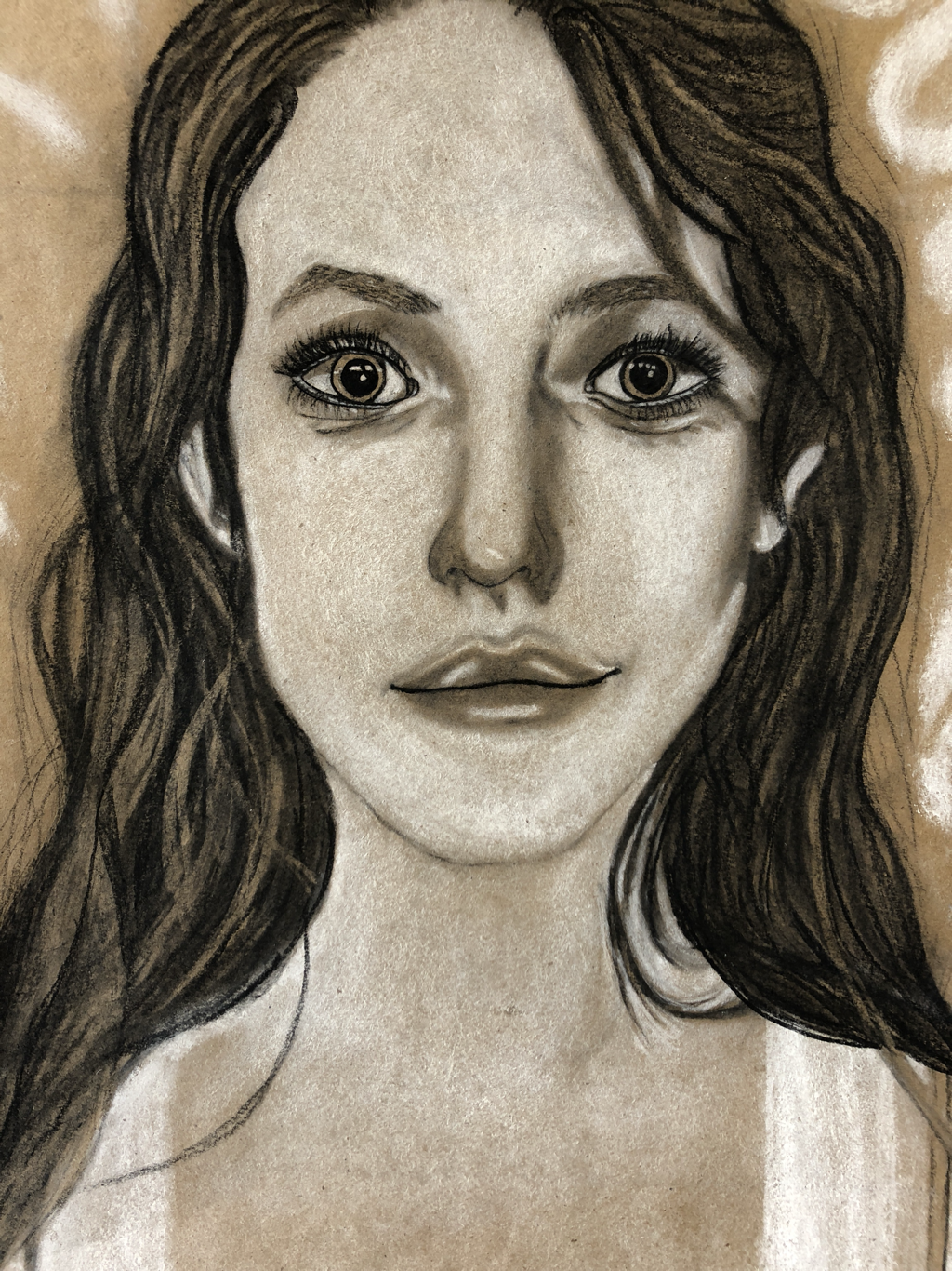
Self Portrait Artist Statement, 2018
1. Define which techniques you tried and mastered? Struggled?
2. How did you draw inspiration from other artists techniques or aesthetics in your work? In what ways did you derive meaning or gain historical perspectives from their work? Why these artists?
3. Describe the evolution of your piece. Decisions made. Compositional elements.
4. If you could consider doing something over, explain why you would do this and what you would do next time?
5. Elaborate on how this piece links with your other pieces? What is the common thread?
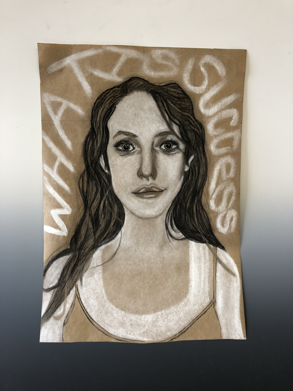
Techniques taught within the class were the techniques I focused on learning in order to create this self-portrait. These techniques consisted of using the grid, skill building of recognizing shapes and shadows. Also using a variety of charcoals to create those shadows by creating different values and different textures. And also, adding text in order to convey a meaning to the drawing. One of these techniques that I felt that I learned and mastered well by the end of the process was using a variety of charcoal and white charcoal to create different values from very light to very dark and medium grays in between or the brown of the paper as a neutral in-between. What I felt that I really struggled with especially in the beginning of the process, was the use of the grid and using shapes to create them into a realistic drawing that doesn't have harsh shapes but flowing lines and value transitions and differences.
I drew inspiration for this piece from various things. Such as, I observed the seniors create their self-portraits from last year which helped provide me with the mental goal of wanting to create a realistic portrait of myself. As well, a peer in my class was very helpful in guiding me in where I could improve to my drawing or teaching me techniques or suggestions on how to make draw my lips making them look 3D, as well as the highlights and lowlights of my hair by erasing dark charcoal sections or lines and recreating them as a medium gray-brown paper highlights. Previous and current peers all gave me inspiration and guided me how I wanted my creation to look and have a strong resemblance to me and those who supported me to help me get that.
Describe the evolution of your piece decisions made and compositional elements. The beginning of my portrait began with the basis of the 4x4 grid on my black and white printed picture and recognizing shapes in the face and connecting lines and finding widths, distances, and ratios in my face. I then transferred all of this onto the grid on my brown paper. I spent a great amount of time on attempting to find the correct placement of my facial features and the shape of my head and jaw to be exact. I became frustrated with the willow charcoal because my dots and lines were constantly smudged or disappeared. I resulted in using a pencil that turned my brown paper into a large, un-erasable mess. This ended up being a positive thing because shortly after I realized that my grid on my printed paper and brown paper were both inaccurate and different sizes uniquely. I started over. The second time around I made sure that both for my grids, each unit was the same size and was scaled to each other. I began with the basics again this time sticking only to connecting the corner of my mouths and nose to my eyes sticking with willow charcoal. The second attempt had a better outcome than the first time. Another aspect that was a big struggle and determined the realism of my drawing in a pleasing way, was drawing myself smiling but with this time, not a teeth smile. And finally, the composition of the text added to my portrait started off as a horizontal, broken text but I didn't find it to be appealing and changed it to arch around to give it more flow. I also wanted the letters to be messy, smudged and not always very distinct.
If I were to redo this project or try it again, what I would do differently is add freckles to my face and draw myself wearing a necklace. I feel that if I added these things it would create a less glossy look and more like me on a daily basis. I would also spend more time trying to create my neck to torso to be more realistic and add in more shadow. In the photo that I used, there were no shadows on my torso only less bright highlights. I would also like to attempt using mediums that are not realistic to a realistic drawing like using gold paint or marker for certain highlights. By adding the gold paint to this piece, it would connect it to the rest of my creations from last year adding in the common thread I used last year with gold spray paint. Besides the paint, this piece is connected to my still life from this year and last year because they all use charcoal and white charcoal.
2. How did you draw inspiration from other artists techniques or aesthetics in your work? In what ways did you derive meaning or gain historical perspectives from their work? Why these artists?
3. Describe the evolution of your piece. Decisions made. Compositional elements.
4. If you could consider doing something over, explain why you would do this and what you would do next time?
5. Elaborate on how this piece links with your other pieces? What is the common thread?
Techniques taught within the class were the techniques I focused on learning in order to create this self-portrait. These techniques consisted of using the grid, skill building of recognizing shapes and shadows. Also using a variety of charcoals to create those shadows by creating different values and different textures. And also, adding text in order to convey a meaning to the drawing. One of these techniques that I felt that I learned and mastered well by the end of the process was using a variety of charcoal and white charcoal to create different values from very light to very dark and medium grays in between or the brown of the paper as a neutral in-between. What I felt that I really struggled with especially in the beginning of the process, was the use of the grid and using shapes to create them into a realistic drawing that doesn't have harsh shapes but flowing lines and value transitions and differences.
I drew inspiration for this piece from various things. Such as, I observed the seniors create their self-portraits from last year which helped provide me with the mental goal of wanting to create a realistic portrait of myself. As well, a peer in my class was very helpful in guiding me in where I could improve to my drawing or teaching me techniques or suggestions on how to make draw my lips making them look 3D, as well as the highlights and lowlights of my hair by erasing dark charcoal sections or lines and recreating them as a medium gray-brown paper highlights. Previous and current peers all gave me inspiration and guided me how I wanted my creation to look and have a strong resemblance to me and those who supported me to help me get that.
Describe the evolution of your piece decisions made and compositional elements. The beginning of my portrait began with the basis of the 4x4 grid on my black and white printed picture and recognizing shapes in the face and connecting lines and finding widths, distances, and ratios in my face. I then transferred all of this onto the grid on my brown paper. I spent a great amount of time on attempting to find the correct placement of my facial features and the shape of my head and jaw to be exact. I became frustrated with the willow charcoal because my dots and lines were constantly smudged or disappeared. I resulted in using a pencil that turned my brown paper into a large, un-erasable mess. This ended up being a positive thing because shortly after I realized that my grid on my printed paper and brown paper were both inaccurate and different sizes uniquely. I started over. The second time around I made sure that both for my grids, each unit was the same size and was scaled to each other. I began with the basics again this time sticking only to connecting the corner of my mouths and nose to my eyes sticking with willow charcoal. The second attempt had a better outcome than the first time. Another aspect that was a big struggle and determined the realism of my drawing in a pleasing way, was drawing myself smiling but with this time, not a teeth smile. And finally, the composition of the text added to my portrait started off as a horizontal, broken text but I didn't find it to be appealing and changed it to arch around to give it more flow. I also wanted the letters to be messy, smudged and not always very distinct.
If I were to redo this project or try it again, what I would do differently is add freckles to my face and draw myself wearing a necklace. I feel that if I added these things it would create a less glossy look and more like me on a daily basis. I would also spend more time trying to create my neck to torso to be more realistic and add in more shadow. In the photo that I used, there were no shadows on my torso only less bright highlights. I would also like to attempt using mediums that are not realistic to a realistic drawing like using gold paint or marker for certain highlights. By adding the gold paint to this piece, it would connect it to the rest of my creations from last year adding in the common thread I used last year with gold spray paint. Besides the paint, this piece is connected to my still life from this year and last year because they all use charcoal and white charcoal.
